In an era where AI generates images in seconds and templates make every website interchangeable, typography becomes the strongest differentiator. In 2026, type goes beyond mere readability: it tells stories, guides attention and defines brand identity.
Variable Fonts: One Font, Infinite Possibilities
Variable fonts have overcome the technical limitations of recent years. A single font file replaces dozens of static cuts and can be infinitely adjusted in weight, width and slant – even responsively, depending on the viewport. This reduces loading time (one variable font instead of ten individual font files) and opens up design possibilities that weren't achievable with static fonts.
In practice, this means: headlines that change their stroke weight as you scroll. Body text that automatically narrows slightly on small screens to optimise readability. And hover effects where type smoothly animates from light to bold – without layout shift.
Kinetic Typography: Type in Motion
Animated text is taking over hero sections and product pages. Fonts that react to scrolling, change with sound or morph on hover are no longer gimmicks in 2026 – they're part of the interface language. The key lies in balance: motion should support perception, not distract from it.
CSS animations and modern JavaScript libraries like GSAP or Framer Motion make kinetic typography accessible – even for teams without dedicated motion designers. What matters is performance: text animations should be based on GPU-accelerated properties (transform, opacity) to avoid impacting the frame rate.
Oversized Headlines and Expressive Type
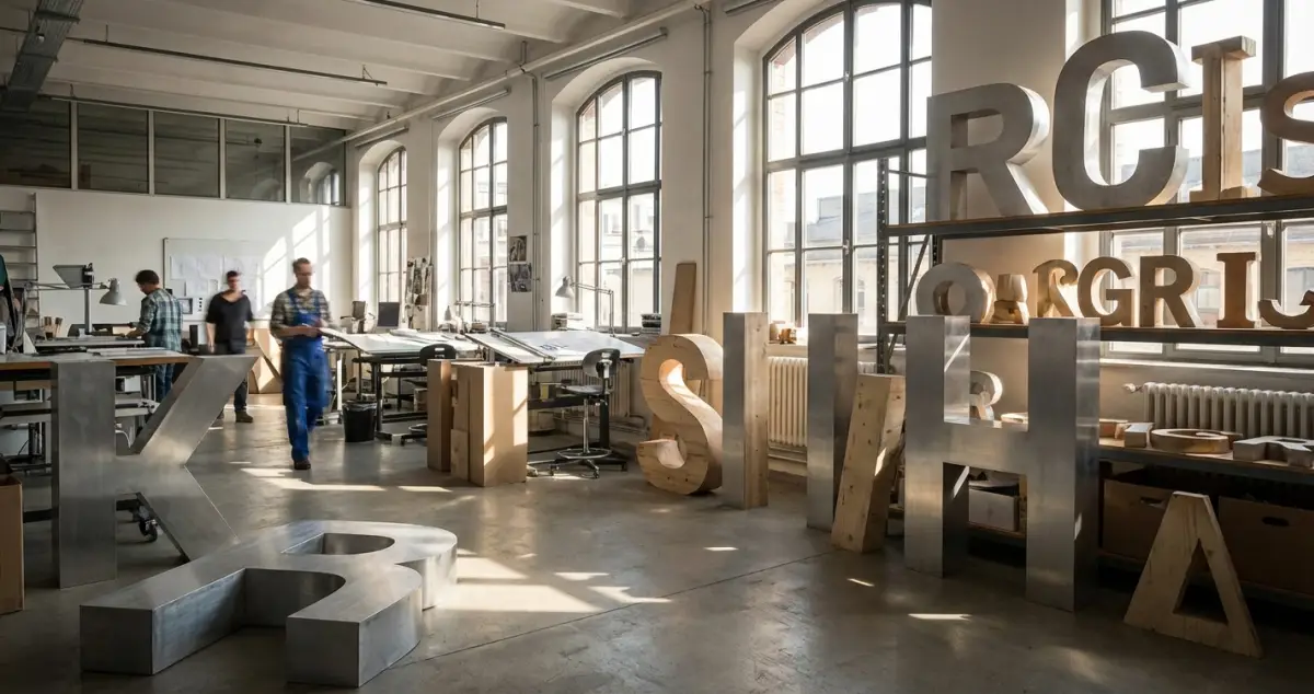
Large, expressive headlines are a dominant trend in 2026. Custom fonts, layered styles and deliberately broken grid structures create bold first impressions. Adobe identifies a trend towards oversized sans-serifs, puffy letterforms and handwritten scripts as personal accents.
For Swiss SME websites, a middle ground works well: a distinctive, oversized headline for the hero section, paired with a clear, highly readable body font. The headline conveys emotion and brand identity, while the body text ensures functionality.
Typography and Sustainability
An often overlooked aspect: system fonts – typefaces already installed on the user's device – eliminate font downloads entirely. This saves loading time and energy. For projects where sustainable web design is a priority, a system font stack is a serious option that doesn't have to look generic.
Conclusion: Type as a Strategic Asset
Typography in 2026 is no longer a passive element. It's an active design tool that communicates brand identity, shapes user experiences and influences technical performance. Invest in your typographic strategy – it's the most cost-effective design decision with the greatest impact.
Want to elevate your website's typography? Sidora AG develops type concepts that match your brand and are technically flawless in implementation. Get in touch.