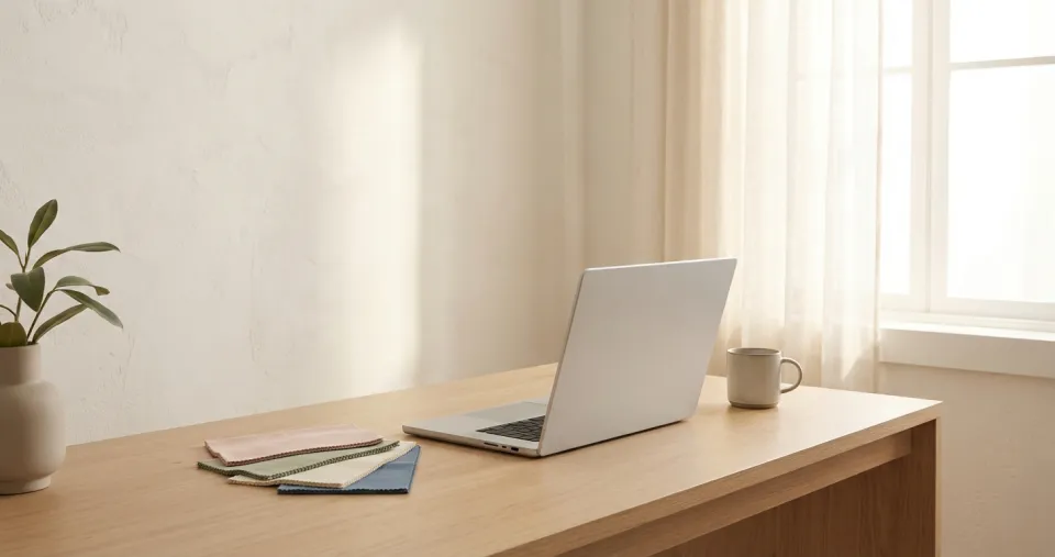
Every year, Pantone's Color of the Year influences the creative industry – from fashion to interiors to web design. For 2026, the choice is PANTONE 11-4201 Cloud Dancer: a soft, warm off-white with a hint of warmth.
The Counterreaction to Dopamine Design
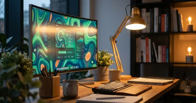
At first glance, Cloud Dancer seems unspectacular. But that's precisely the point: after years of neon gradients and dopamine design saturation, Pantone is signalling calm, clarity and authenticity. In the web design world, this aligns with the trend towards nature-inspired aesthetics – earthy tones, skin, wood and stone colours that make digital spaces feel warmer.
How to Use Cloud Dancer in Digital Design
As a dominant background colour: Cloud Dancer is warmer than pure white (#FFFFFF) and reduces screen fatigue. Ideal for content-heavy pages where readability is the priority.
As a contrast partner: Combined with bold accent colours – a rich blue, a warm terracotta or the classic Sidora blue (#009cf2) – Cloud Dancer reaches its full effect. The calm base lets the accents shine.
In branding: For companies that want to communicate trust, naturalness and quality, Cloud Dancer is a powerful signal. Particularly in industries like healthcare, consulting and premium services.
Our take: Cloud Dancer isn't a trend you actively "implement". It's a confirmation of what good web design has always been about: leaving space, creating clarity, letting content speak.
Time for a colour refresh on your website? We're happy to advise you on colour strategy – from brand positioning to UI implementation.