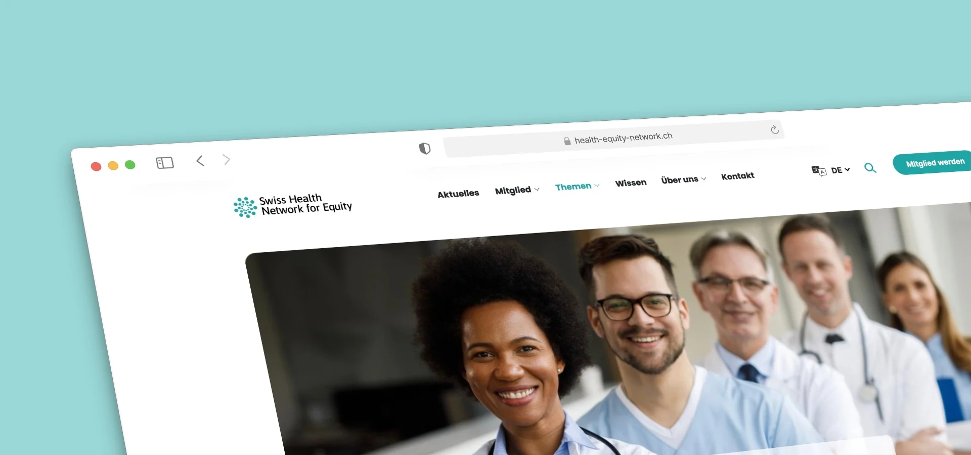
Swiss Health Network for Equity – Brand, Multilingual Website and Print Design
The Swiss Health Network for Equity is a non-profit organisation committed to fairer, more accessible healthcare in Switzerland – supported by professionals from healthcare, politics, science and civil society, and backed by the Federal Office of Public Health and the State Secretariat for Migration. For this network, we developed the entire presence: from the brand and the multilingual website to the printed communication materials.
It started with the brand. From the guiding idea "United for health and fairness", we created a distinctive visual world: a dotted network mark, a fresh colour palette in teal and green, and a continuous line illustration that draws a wide variety of people together into one connected line. This motif runs through every channel as a unifying element, making the network's aspiration – diversity and cohesion – visible at a glance.
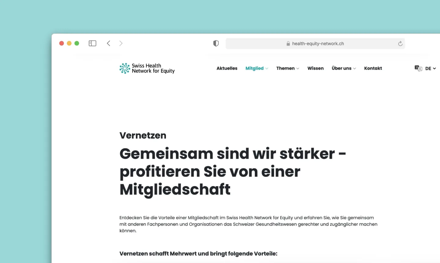
On this foundation, we designed the website and built it with Craft CMS. The presence is fully four-lingual (German, French, Italian, English) and is organised into clearly guided areas: news and events, a membership area with a join process and a searchable member directory, thematic priorities such as mutual understanding, equal opportunity and awareness, plus a knowledge section with professional resources. Prominent "Become a member" calls to action accompany visitors throughout the site.
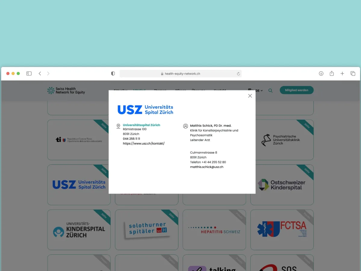
The member directory is more than a list: each organisation – from university hospitals and cantonal bodies to specialised agencies – gets its own profile with contacts and details, making the network tangible as a living community. The organisation maintains all content – text, images, events and members – independently via the Craft CMS backend, without depending on developers.
So the presence does not stop at the edge of the screen, we carried the brand language into print as well. As part of the graphic and print design, we produced flyers and further communication materials that adopt the same visual world, typography and colours as the website. Online and offline feel like one coherent whole – an important trust factor for a network representing a sensitive social cause.
From the outset, we focused on clean, accessible implementation and solid discoverability: a well-considered page structure, language-appropriate URLs, fast loading times and semantic HTML. The result is a cohesive overall presence that underlines the network's credibility, wins new members and makes the topic of health equity visible across Switzerland.

About our reference projects
Every project on this page is real work from our everyday business — no made-up examples. We show what we have achieved together with our clients, from the first idea to the finished result.
Want to know which steps are behind a project like this? You'll find an overview under services. And if you have something of your own in mind, we are happy to hear about your situation without obligation.
Discuss your project
Bereit fuer Ihr naechstes Projekt? Lassen Sie uns sprechen.
Discuss your project